- cross-posted to:
- typography@lemmy.ml
- cross-posted to:
- typography@lemmy.ml
You must log in or # to comment.
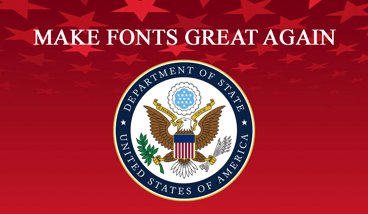
I’m surprised the US is not going to choose this font
Tfw there is now the wrong font and the Reich font
Or Storm Font.
𝕿𝖍𝖊𝖞 𝖜𝖔𝖚𝖑𝖉 𝖈𝖊𝖗𝖙𝖆𝖎𝖓𝖑𝖞 𝖑𝖔𝖛𝖊 𝖎𝖙, 𝖇𝖚𝖙 𝖙𝖍𝖊𝖞 𝖕𝖗𝖔𝖇𝖆𝖇𝖑𝖞 𝖈𝖆𝖓’𝖙 𝖗𝖊𝖆𝖉 𝖎𝖙 𝖙𝖍𝖊𝖒𝖘𝖊𝖑𝖛𝖊𝖘.
𝕺𝖓 𝖘𝖊𝖈𝖔𝖓𝖉 𝖙𝖍𝖔𝖚𝖌𝖍𝖙, 𝖙𝖍𝖔𝖚𝖌𝖍, 𝖞𝖔𝖚’𝖗𝖊 𝖗𝖎𝖌𝖍𝖙, 𝖎𝖙 𝖉𝖔𝖊𝖘𝖓’𝖙 𝖒𝖆𝖙𝖙𝖊𝖗…𝖒𝖔𝖘𝖙 𝕹𝖆𝖟𝖎𝖘 𝖈𝖆𝖓 𝖍𝖆𝖗𝖉𝖑𝖞 𝖗𝖊𝖆𝖉 𝖆𝖓𝖞𝖜𝖆𝖞, 𝖘𝖔…
I always disliked Times New Roman because it looked old timey and looked like it belonged more on a piece of paper than on a screen.
Well now I’m going to dislike it even harder.
Comic Sans fits this administration better
These wing-dings should be firced to use wing-dings
Hey that’s mean. Comic sans didn’t do anything to be treated like this
FONTS ARE WOKE
That makes sense, so did the Times.
“Biden wasted time and money switching fonts and we hate that, so now we will waste an equivalent amount of time and money switching back”
What a moron.
That reminds me of a joke I heard as a kid…“Did you hear about the idiot who tried to swim across the Atlantic ocean? He was halfway there but got tired so he turned around and swam back!”.
I mean I don’t know about currents and all that myself, but I can see a world where that makes sense.
How much was wasted changing maps with “gulf of america” and documents with “department of war”. But i guess thats fine cause the cheeto said so.

(Written in LibreOffice.)
Someone should hack the websites and change everything to Wingdings as retribution
💣︎♋︎🙵♏︎ ✌︎❍︎♏︎❒︎♓︎♍︎♋︎ ✋︎●︎●︎♓︎⧫︎♏︎❒︎♋︎⧫︎♏︎ ✌︎♑︎♋︎♓︎■︎
I think Fraktur or Antiqua fits this administration better.
of course it should be lucida console