Hi, mostly small improvements in this release. I spent a bunch of time on a horizontal swipe to go to the next post but it still needs some work. Anyways if you want to check it out it’s under an Experimental tag at the bottom of settings. If you use List view I hope you like this release as I made some improvements to the List view layouts.
What’s new
- General font size adjustments
- Comment replies are now selectable when replying
- Added Reset buttons to all colour pickers
- Blocked instance comments now have an optional message to show them
- Improved the ‘Show more comments’ button in some scenarios. Should show on Profile views now too if there are responses.
- Moved the instance name down from the title as it was getting cut off in same cases
- Added user tag options to comments and posts action menus
- Experimental feature horizontal swipe for next post
- Improved the UX of the list views
- Added ‘Copy URL’ to image views
Fixes
- Fixed theme surface and background not resetting
- Fixed an issue where saving settings would override theme customizations in some scenarios
- added option to block instances via post options menu
- Now only one comment can be active at a time, clicking another comment will deselect the previous one
- Changed user tags to use the tertiary comment, should be more obvious now
- Clicking the + button to create a post in a community should now autofill that community.
- Fixed a bug where the reply button wouldn’t work if swipe navigation was turned off.
Question: would you prefer to see a bottom navigation drawer or top level comment navigation (^ prev v next) in the next release?
Links:
-kuroneko
Did ‘hold to collapse’ used to work on the white space to the right of a comment title? It seems to require holding over some text now.
For comments on a post made by OP, on the OLED theme at least, it’s very hard to tell them apart from everyone else because the color is so similar. You may want to adjust that color, or pick a default secondary color.
Using the app right now and it’s smooth. Nice one :)
Don’t know if I can submit a request here but I would appreciate if we can get a scroll to the top button.
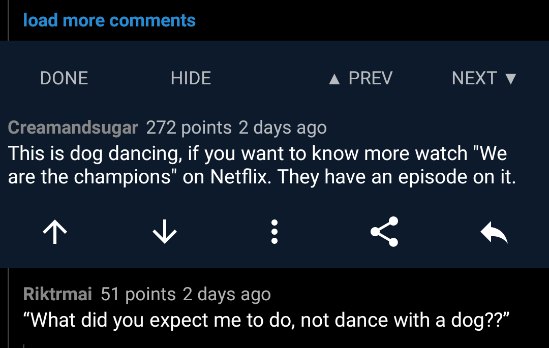 Top level comment navigation would be great. Here’s how it was done in Rif. As you press next it will scroll to next comment so that it’s aligned with the buttons of the previous comment --> buttons stay in the same place.
You can also see the high information density in the picture. You can have many actions in a tiny comment box if everything is tightly packed.
I like this app. It reminds me of Boost for Reddit! Love the font and color customization
This is how i configured the app:


Edit: had some issues with settings resettingbut i hadnt updated the app yet. It works fine now!
Edit2: hm having troubles using the comment toolbar to upload a picture. The buttons seem nearly unclickable. They dont seem to have enough height
Edit3: the comment font scaling is small with global font size set to medium
But this community is for Connect for Lemmy? Did you post a screenshot of a different app?
Hi! No this is Connect. The theming probably makes it look like something else
Sorry, I see that now! All the Sync comments in your screenshot must have confused me.
Minor stuff:
-
The placeholder text here is kind of invisible in dark mode.
-
While this theme color appears to affect the side drawer, toasts, text boxes, and buttons; it doesn’t actually appear to change the card color

(also, colour is totally misspelled… there’s an extra “u” in there… 🇺🇲 😉 )
-
Is Connect open source?
Question
Why not both?
Bottom navigation drawer, with floating ↑ and ↓ buttons, alongside the Reply / Add Post button.
I’d even support doing away with auto-hide on the Reply / Post floating button to facilitate this. More often than not, the button is hidden when I want it, and I can’t convince the app to make it reappear.
What’s the difference between the navigation drawer and floating buttons? Both do the exact same thing or am I missing something?
I assumed the drawer would be kind of a “bottom bar” , moving some stuff currently in the sidebar menu (frontpage/ profile / inbox / saved / profile).
It’s also possible I assumed super wrong.
Dang bugs in 69 ruined all my chances to say “Nice.” As usual, great update. Thanks for implementing that ability to select text on replied comments. And nested comments in my profile is a great thing I never realized I needed.
One BUG I’m seeing is that the Edit Comment icon frequently isn’t showing up on my comments. Specifically on my Profile page, and when I tap comments on my Profile to view the parent post. Potentially more places, but those seem to stand out the most. (EDIT: Also missing immediately after posting the comment. Had to exit Connect and manually find this post to add this edit.)