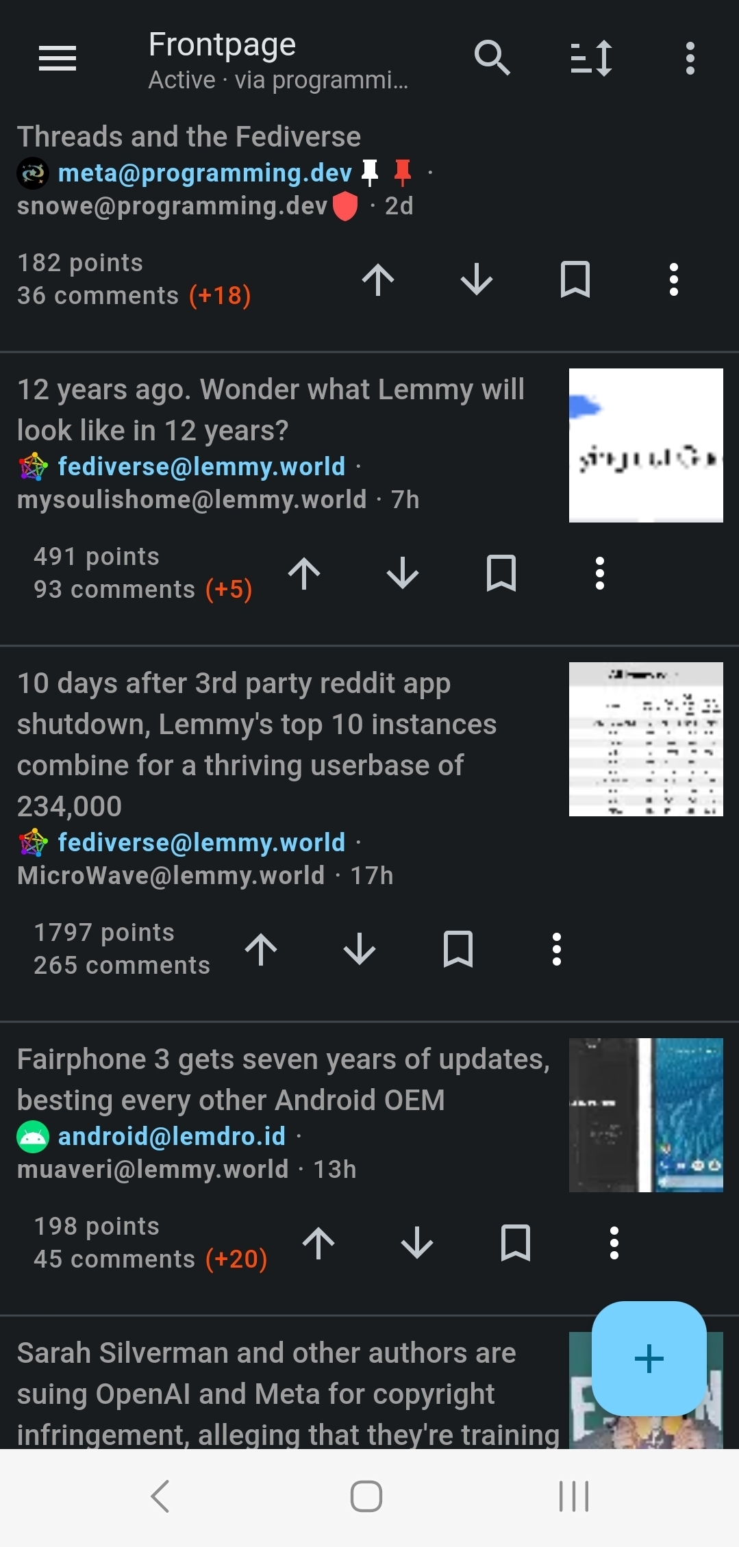
Hi, only bug fixes in this release as the feature I’m working on isn’t quite ready yet and I had to set up a local instance of Lemmy for testing purposes without spamming a live instance. Hopefully this means more testing from my side going forward and more app stability. For thumbnails I’m now loading in better compressed images so you should see memory and network improvements, especially on list views where I also scale the thumbnail to the size of the list card, 1MB images are now 10KB in my testing. I changed the upvote colour to more of an orangey colour. It matches the app icon orange now. If you have the setting to open links in a external browser it no longer applies to opening images.
What’s new
- Upvote colour is now orange
- Thumbnails are now more efficient (especially list views)
- Images no longer open in external browser
- Communities will now respect the ‘Should Launch Externally’ setting on open
Fixes
- Comment hint text (‘Comment’) now matches your theme settings
- Comment textbox is now autofocused so no extra click needed
- Improved the text visibility of the Notificiation icon number
- List view images are now aligned to the top and not the center
- Fixed a minor left padding issue on List view body text
- Adjusted the text for ‘Show Post Bottom bar’ to better reflect what it does
- Fixed a bug with Subscribe/Unsubscribe not showing correct values in the top right action menu
- Fixed the error message when unable to find a person
- Fixed copy url action item for web views
Thank you so much for all of your feedback! A bottom nav drawer seems like the most requested feature currently so please look forward to that! It will have an option to disable for those that don’t prefer it.
Links:
-kuroneko


I suspect there is a better solution for thumbnails, but not sure if it’s you or Lemmy devs who would have to fix it.
This is how thumbnails look on my device, basically anything with text is completely unreadable:
This image, for example, is 109KB https://lemmy.world/pictrs/image/7fd7eeaa-f466-4697-8ea9-2f16e4372adc.jpeg
This is what Lemmy generates for it at thumbnail=128: https://lemmy.world/pictrs/image/7fd7eeaa-f466-4697-8ea9-2f16e4372adc.jpeg?format=jpg&thumbnail=128
And this is what my local imagemagick makes when asked to resize the original to 128w at 50% quality: https://ibb.co/ZgT35p4
Lemmy image is 4906 bytes and unreadable and the Imagemagick is 1398 bytes and you can make out the text.
And that’s before getting into cropping etc. Basically, there’s room for improvement, somewhere.
Edit: seems like pict-rs (the library Lemmy uses for image hosting) uses imagemagick to compress images, so it’s probably just to do with the selection of filters/options they’ve chosen.
Thank you for diving into this. I suspect it’s how they’re generating the thumbnail as well. Until it changes upstream I’ve increased the thumbnail size so it gets downscaled locally and is a bit more clear. Not the best solution but better than un-readable thumbnails.