Hi there! First of all, I wanted to say thank you. Thanks for submitting bugs and PRs, sharing wefwef, and for the overwhelming kindness from everyone here. 💙 I would not be writing this post right now if it wasn’t for that.
I have a few important announcements in this thread, so please read on!
(TLDR subscribe to !voyagerapp@lemmy.world!)
The road to v1
Somehow, after only a few weeks, v1 is in reach! That being said, there are a few important features needed in order to get there:
- Blocking and unblocking users and communities
- Hide NSFW posts toggle
- Community favorites
- Better keyboard handling on comment and post dialogs
- Workaround for light mode status bar on iOS
- Direct connect to lemmy.world instead of proxy workaround
Keep in mind, v1 won’t be perfect. There will be bugs :) This is just the point at which we feel there is nothing critical outstanding.
Our new name: Voyager
Thanks so much for all of the really great and important points for either keeping wefwef or changing to Voyager. A recurring theme I heard is that while wefwef is a fun, unique name, Voyager is a more approachable name. To me, that’s important. I’ve decided on Voyager!
With that, I’m also happy to announce some new domain names!
- https://vger.app - Official web app deployment
- https://getvoyager.app - Official onboarding link (redirects to /settings/install, for now)
(Don’t worry, wefwef.app will continue working for the foreseeable future!)
And our new Lemmy community, !voyagerapp@lemmy.world
We will be transitioning to this new name effective Monday July 10 when the old wefwef community will be locked. Subscribe to !voyagerapp@lemmy.world!
App icon contest
EDIT: SUBMISSIONS NOW OPEN! https://lemmy.world/post/1287799
As part of the v1 launch, I’m hoping to adopt a new community-driven app icon! 🥰 I can’t wait to see what you all come up with!
What do I win??
wefwef *ahem* Voyager is a free and open source project, so there isn’t a cash prize or anything. But, credit to you will be officially in the app settings and the Github repo readme!
Submission deadline
On July 10th I will create a thread for submissions in !voyagerapp@lemmy.world. On July 16th, 10pm CT submissions will close (depending on submission volume, may be extended).
Selection process
I will lock the thread after the submission window and nominate 3 icons (see below tips for what I’m looking for). I’ll take into account votes and comments from people. :) If there are very few submissions, I may extend the window to submit. Shortly after, I’ll create another thread for the community to vote to choose one of the final three!
Tips
- I encourage you to make the app icon FUN and colorful! Give the app a soul that reflects the community driven nature of Lemmy and the greater Fediverse. Icons using the display-p3 colorspace are encouraged. I love how an interconnected rainbow represents the Fediverse, and I’d love to see your personal artistic style :)
- I am purposely allowing raster icons for this contest, because I think too many app icons look bland, generic and… well… corporate vector bleh. I love the fun style of these Fediverse illustrations by David Revoy: https://framablog.org/2022/12/08/framasoft-2022-a-casserole-cooked-up-thanks-to-you-thanks-to-your-donations/?print=print
Rules
- 3 submissions max per artist
- Please, no submissions resembling the Apollo icon (sorry!) to respect Apollo’s app icon branding
- For each submission, required assets:
- (For contest submission)
- Single 512x512 square PNG designed for iOS should be in your comment. (If you have an iOS device, I recommend this site to test)
- Optional sentence or two explaining your icon
- (Upon being selected)
- 1024x1024 PNG or SVG iOS app icon.
- 1024x1024 PNG or SVG “maskable” variant for Android app icon. Tips here: https://web.dev/maskable-icon
- BONUS/OPTIONAL Splash screen image - Design a full screen app launch screen that is maskable to fit various device aspect ratios. This is totally optional.
- (For contest submission)
- Your work should be licensed under CC-BY-SA 4.0, or less restrictive. :)
That’s all! Thanks for reading this far! 💙
P.S. Did I mention subscribe to !voyagerapp@lemmy.world?
Can’t wait to tell people years from now I used Voyager back when it was “wefwef.” Thanks for the great work so far and congrats on the change! 🫡
Thanks for the update, you guys are so amazing with the rapid updates!
BOOOOOOOOO to the name change though! It’ll always be wefwef to me ;)
Voyager is a much better name.
I exclusively use wefwef to interact with Lemmy and I’m excited to see how it progresses from here. Nothing short of incredible work on your part! I’ll absolutely be submitting icons to consider, and look forward to using v1 and beyond.
Keep it up!!!
I’m glad that wefwef.app will remain operative: although Voyager is a better name, the new domain is quite hard to remember imo
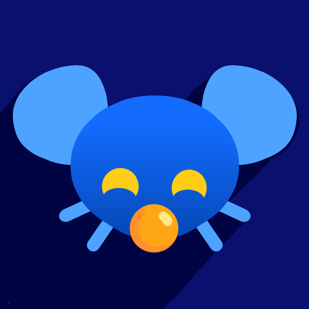
Here’s my entry:

@Tucker where’s yours?
If anyone has suggestions (thinks to add/change/take away) let me know!
Edit: V2 without crown…
Hey dumb question, how do you link a user in your comments?
wefwef *ahem* Voyager is a free and open source project, so there isn’t a cash prize or anything. But, credit to you will be officially in the app settings and the Github repo readme!
Hey, you’ve got a community now so you don’t have to go it alone. I’d be willing to Venmo the winner $10 and I’m sure others who appreciate it would be willing to do the same. If aeharding@lemmy.world would be willing to act as a go between and PM the winner’s Venmo, I propose that people who are willing to pitch in a few bucks comment here.
How can one switch from wefwef to voyager? Do I need to install a new webpage?
there are a few important features needed in order to get there:
Might I suggest (sorry that I keep nagging you):
- editing and deleting OPs
IMO, I think this is an essential feature for version 1. I know little to nothing about app development, but it seems like a relatively simple upgrade to me.
But it’s obviously just a feature request. You and the other devs are doing all the work and choose what you give priority.
I was a bit confused that that wasn’t already on the list. It’s the only reason why I have to keep going back to the website
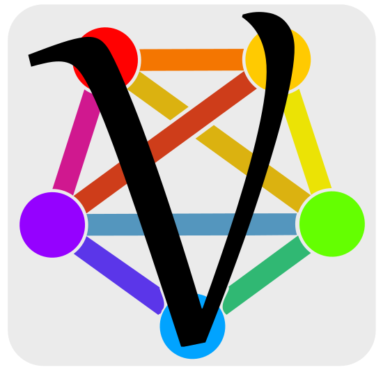
A quick mockup of my entry, it’s rough because I don’t have access to illustrator atm and I’m not used to inkscape yet. “Lemmy” know what you think! The font used for the ‘V’ is definitely something that could be changed for the better. Basically just wanted to get the fediverse logo in there.
Idk if this has been mentioned before, but plans for an actual app?
There are experiments.
If there is an “actual app” it will be exactly the same as now with a couple tweaks (like haptics)
I ask for the smallest of reasons in that I don’t have any apps on my Home Screen and PWAs can’t go in the app drawer. Seems like PWAs can be a bit more picky too when using
I agree it would definitely be “cleaner” for it to be a real app and avoid the workaround, but if you don’t want an extra home screen floating around with just voyager when you enter “wiggle mode” tap the three dot thing towards the bottom then tap the screen with voyager to hide it. It will still be in the app drawer, and you can get back to the cleaner Home Screen with just widgets or whatever you prefer.
Oh shit, that’s gonna open a whole new world for me, I had no idea that workaround existed! Thank you, definitely giving it more of a go now
Do you plan on creating an app or stick to PWA?
¯_(ツ)_/¯ sticking with PWA for now. Things are changing day by day though.
I miss the bot that used to come along and give you back your missing arm \
Be the change you want to see 😂
I’m on the camp of sticking it with PWA, it’s perfect.
deleted by creator


